

Table of Contents
- Introduction
- Design Fundamentals of Graphic Overlays
- Material Selection for Custom Overlays
- Advanced Printing Techniques
- Color Management and Brand Consistency
- Texture and Finish Options
- Window and Display Integration
- Embossing and Tactile Features
- Durability and Environmental Considerations
- Design Software and File Preparation
- Common Design Mistakes to Avoid
- Cost Optimization Strategies
- Frequently Asked Questions
Quick Answer: Custom graphic overlay design for membrane switches involves creating the visual and tactile interface layer using materials like polyester or polycarbonate, with screen-printed graphics, selective texturing, and integrated windows. The process requires careful consideration of material properties, printing techniques, color management, and durability requirements to achieve professional results that meet both aesthetic and functional specifications.
The graphic overlay serves as the face of your membrane switch, combining visual appeal with functional durability. With over 15 years in membrane switch manufacturing at JASPER, I've seen how proper overlay design can make or break a product's success in the market. This comprehensive guide covers everything from material selection to advanced design techniques for creating professional custom graphic overlays.
Design Fundamentals of Graphic Overlays
The graphic overlay is more than just a decorative element - it's the primary user interface that must balance aesthetics, functionality, and durability. Understanding the fundamental design principles ensures your overlay meets both user expectations and manufacturing requirements.
Layer Structure and Composition
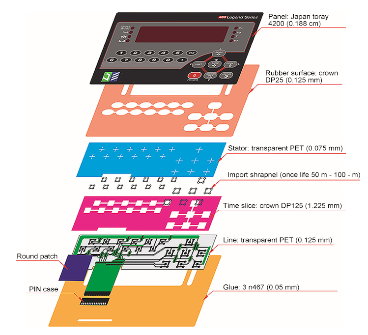
A typical graphic overlay consists of multiple layers working in harmony. The base substrate material forms the foundation, typically 0.005" to 0.010" thick polyester or polycarbonate. The second layer involves the printed graphics applied to the material's second surface (reverse printed) for protection. An adhesive layer bonds the overlay to the switch assembly, while selective texturing or clear windows may be incorporated for specific functional areas.
Key Design Parameters
Critical design parameters include material thickness, which affects tactile response and durability; color specifications using Pantone or RAL standards for consistency; surface texture ranging from matte to high gloss; and dimensional tolerances typically held to ±0.005" for critical features. The overlay must also accommodate embossed areas for tactile feedback, with typical emboss heights of 0.015" to 0.025".
User Interface Considerations
The overlay design must prioritize user experience through clear visual hierarchy, intuitive button layout, and appropriate contrast ratios. Text should maintain minimum heights of 0.100" for readability, while icons require sufficient detail at 0.125" minimum size. Consider viewing angles and lighting conditions in the final application environment, as these factors significantly impact visibility and usability.
Material Selection for Custom Overlays
Choosing the right material for your graphic overlay directly impacts performance, durability, and cost. Each material offers distinct advantages depending on your specific application requirements.
Polyester (PET) Overlays
Polyester remains the most popular choice for membrane switch overlays due to its excellent chemical resistance and dimensional stability. Available in various thicknesses from 0.005" to 0.010", polyester offers superior resistance to oils, greases, and most industrial chemicals. The material maintains its properties across temperature ranges from -40°F to 180°F, making it suitable for both indoor and outdoor applications. Polyester accepts both screen printing and digital printing well, providing vibrant colors and sharp graphics.
Polycarbonate (PC) Overlays
Polycarbonate offers enhanced impact resistance and temperature tolerance compared to polyester, withstanding continuous exposure up to 240°F. The material's superior optical clarity makes it ideal for applications requiring integrated windows or display areas. However, polycarbonate shows less chemical resistance than polyester, particularly to alkaline cleaners and certain solvents. Its higher cost typically reserves it for demanding applications where impact resistance or temperature tolerance is critical.
Specialty Materials
Specialty overlay materials address unique application requirements. Antimicrobial polyester incorporates silver ion technology for medical and food service applications. Hard-coated polyester provides enhanced scratch resistance for high-wear environments. UV-stabilized materials prevent yellowing and degradation in outdoor applications, while anti-glare treatments reduce reflection in bright lighting conditions.
Advanced Printing Techniques
The printing method significantly influences graphic quality, durability, and production cost. Understanding each technique's capabilities helps select the optimal approach for your specific requirements.

Screen Printing Excellence
Screen printing remains the gold standard for membrane switch overlays, offering exceptional color density and durability. The process deposits ink layers of 0.0005" to 0.001" thickness, creating vibrant, opaque colors that resist fading and wear. Multi-layer printing achieves complex graphics with up to 10 colors, though most designs utilize 3-5 colors for cost efficiency. Special effects like metallic inks, phosphorescent materials, and textured finishes expand design possibilities.
Digital Printing Applications
Digital printing excels for prototypes, short runs, and designs requiring photographic quality or gradient effects. UV-curable inks provide immediate curing and excellent adhesion to treated substrates. While per-unit costs remain higher than screen printing for large volumes, digital printing eliminates screen charges and enables variable data printing for serialization or customization.
Hybrid Printing Solutions
Combining screen and digital printing techniques leverages each method's strengths. Screen printing provides durable base colors and selective textures, while digital printing adds fine details, gradients, or variable information. This approach optimizes both quality and cost for complex designs requiring both durability and detailed graphics.
Color Management and Brand Consistency
Maintaining color consistency across production runs ensures brand integrity and professional appearance. Implementing proper color management systems prevents costly rejections and customer dissatisfaction.
Color Specification Standards
Specify colors using industry-standard systems like Pantone Matching System (PMS) or RAL colors for precise communication with manufacturers. Provide physical color samples when possible, as monitor displays rarely represent true colors accurately. Define acceptable color tolerances using Delta E measurements, typically ΔE < 2 for critical brand colors and ΔE < 4 for non-critical elements.
Achieving Color Accuracy
Color accuracy depends on multiple factors including substrate material, ink formulation, and printing parameters. White or light-colored substrates provide the truest color reproduction, while transparent materials require white backing layers for opacity. Consider how different lighting conditions affect color perception - fluorescent, LED, and natural light can significantly alter appearance.
Production Consistency
Maintaining consistency requires documented color standards, regular calibration of printing equipment, and systematic quality control procedures. Establish master samples for reference and implement batch testing protocols. Environmental factors like temperature and humidity affect ink viscosity and drying, requiring controlled production environments for critical color matching.
Texture and Finish Options
Surface texture dramatically impacts both aesthetics and functionality, influencing tactile feel, glare reduction, and contamination resistance.
Matte and Anti-Glare Finishes
Matte finishes reduce surface reflections by 60-80%, improving visibility in bright environments. The textured surface scatters incident light, eliminating hot spots and improving readability from various angles. Fine matte textures (10-20 gloss units) provide subtle anti-glare properties while maintaining graphic clarity. Aggressive matte textures (5-10 gloss units) maximize glare reduction but may slightly soften fine graphic details.
Gloss and Semi-Gloss Options
Gloss finishes (>80 gloss units) create premium appearance with deep color saturation and sharp graphic reproduction. The smooth surface facilitates cleaning but shows fingerprints and scratches more readily. Semi-gloss finishes (40-60 gloss units) balance aesthetic appeal with practical maintenance requirements, offering moderate glare reduction while maintaining good graphic quality.
Selective Texturing Techniques
Combining different textures within a single overlay creates visual hierarchy and functional differentiation. Screen-printed selective texture varnishes apply matte or gloss finishes to specific areas, highlighting important controls or creating anti-slip surfaces. This technique adds minimal cost while significantly enhancing both appearance and usability.
Window and Display Integration
Integrating transparent windows for displays, LEDs, or indicators requires careful design consideration to maintain both functionality and durability.
Window Design Options
Clear windows can be created through selective printing, leaving substrate areas unprinted for maximum clarity. Die-cut windows with inserted clear or colored filters provide enhanced protection for display areas. Printed transparent colors create tinted windows for LED indicators while maintaining color consistency. Window areas typically require 0.010" minimum clearance from printed graphics to prevent ink migration or edge lifting.
Display Protection Methods
Protecting underlying displays while maintaining visibility requires appropriate material selection and treatment. Hard-coated polyester or polycarbonate provides scratch resistance for high-contact areas. Anti-reflective coatings improve display readability in bright environments. UV-filtering materials prevent display degradation from prolonged sun exposure while maintaining optical clarity.
LED Integration Strategies
LED indicators integrate seamlessly through various methods. Dead-front printing creates hidden indicators visible only when illuminated, using special translucent inks that appear opaque when unlit. Color filtering through printed transparent inks modifies LED appearance to match design requirements. Light pipes or diffusion printing ensures even illumination across indicator areas.
Embossing and Tactile Features
Embossing creates three-dimensional features that enhance tactile feedback and visual appeal, critical for user interface effectiveness.

Embossing Design Parameters
Standard emboss heights range from 0.015" to 0.025", with 0.020" providing optimal tactile feedback for most applications. Emboss diameters should maintain a 3:1 ratio with material thickness for proper formation without stress cracking. Minimum spacing between embossed areas equals material thickness plus 0.030" to prevent distortion. Multi-level embossing creates varied tactile responses, though each level adds tooling complexity and cost.
Pillow Embossing vs Rim Embossing
Pillow embossing creates smooth, dome-shaped buttons with gradual edges, providing comfortable tactile feel and even stress distribution. The technique works well for larger button areas (>0.375" diameter) where gentle activation is desired. Rim embossing forms distinct edges around button perimeters, creating crisp tactile definition for smaller buttons or when clear button boundaries are essential. Rim embossing typically provides more positive tactile feedback but requires precise tooling alignment.
Braille and Raised Graphics
ADA-compliant Braille requires specific dot heights (0.025" to 0.037") and spacing standards for accessibility. Thermoforming or embossing techniques create Braille dots meeting regulatory requirements. Raised graphics for logos or symbols follow similar principles but allow more design flexibility. Consider that embossed areas may show slight color variation due to material stretching, requiring color compensation in critical applications.
Durability and Environmental Considerations
Designing overlays for long-term durability requires understanding environmental challenges and implementing appropriate protective measures.
Chemical Resistance Requirements
Define specific chemical exposure requirements based on the application environment. Medical devices require resistance to disinfectants like isopropyl alcohol, quaternary ammonium compounds, and bleach solutions. Industrial applications may face oils, fuels, or hydraulic fluids. Specify testing protocols using actual chemicals at expected concentrations and exposure durations. Hard-coated overlays provide enhanced chemical resistance but may affect tactile properties.
UV Stability and Outdoor Performance
Outdoor applications demand UV-stabilized materials and inks to prevent degradation. UV inhibitors in the substrate prevent yellowing and embrittlement over 5-10 year lifecycles. UV-resistant inks maintain color stability with minimal fading (<5 Delta E) after 1000 hours xenon arc exposure. Consider thermal cycling effects, as repeated expansion and contraction can cause adhesive failure or graphic cracking.
Abrasion and Wear Resistance
High-use applications require enhanced wear resistance through hard coatings or protective overlaminates. Specify abrasion resistance using Taber testing with defined wheels and loads. Typical requirements range from 10,000 to 100,000 cycles depending on application severity. Consider that textured surfaces generally show less visible wear than glossy finishes, making matte finishes preferable for high-contact areas.
Design Software and File Preparation
Proper file preparation ensures smooth transition from design concept to manufactured product, preventing delays and quality issues.
Recommended Design Software
Professional vector graphics software like Adobe Illustrator provides precise control over colors, dimensions, and layer management. Create designs at 1:1 scale to prevent scaling errors during production. Use spot colors rather than CMYK for accurate color reproduction in screen printing. Maintain organized layer structures separating graphics, text, cutlines, and emboss areas for clear communication with manufacturers.
File Format Requirements
Submit final designs in vector formats (AI, EPS, PDF) preserving editability and color information. Embed or outline all fonts to prevent substitution issues. Include separate layers for each print color, clearly labeled with Pantone or color specifications. Provide dimensioned drawings showing critical measurements, tolerances, and assembly notes. High-resolution (300 DPI minimum) raster images may supplement vector files for photographic elements.
Design for Manufacturing Guidelines
Maintain minimum line weights of 0.004" for positive images and 0.006" for reverse (knockout) text. Text heights should exceed 0.080" for optimal legibility, with 0.100" preferred for critical information. Allow 0.005" trapping (overlap) between adjacent colors to prevent registration gaps. Design within manufacturer's standard tolerances, typically ±0.005" for critical dimensions and ±0.010" for overall size.
Common Design Mistakes to Avoid
Learning from common design mistakes prevents costly revisions and production delays while ensuring optimal overlay performance.
Color and Contrast Issues
Insufficient contrast between text and background remains the most frequent design error, causing readability problems especially in variable lighting conditions. Maintain contrast ratios exceeding 4.5:1 for normal text and 7:1 for critical information. Avoid using colors that appear similar under different lighting types - reds and oranges often merge under certain fluorescent lights. Test designs under expected use conditions before finalizing.
Dimensional and Tolerance Errors
Designing features too close to material limits causes production difficulties and field failures. Maintain minimum 0.060" borders from overlay edges to prevent adhesive squeeze-out. Allow adequate spacing between embossed buttons - cramped layouts cause activation of adjacent switches. Consider material expansion and contraction in outdoor applications, designing 0.010" clearance for thermal movement in assemblies over 12" dimension.
Material and Process Mismatches
Selecting incompatible materials and processes creates quality issues and increased costs. Specifying hard-coated materials for heavily embossed designs causes coating cracks. Requiring tight color matching on transparent substrates without white backing yields poor results. Designing fine details beyond screen printing capabilities necessitates expensive digital printing. Understand process limitations and design accordingly to optimize quality and cost.
Cost Optimization Strategies
Strategic design decisions significantly impact production costs without compromising quality or functionality.
Color Reduction Techniques
Each additional screen-printed color adds setup costs and production time. Combine similar colors where possible - slight shade variations often go unnoticed in non-critical areas. Use halftone screening to create color variations from single base colors. Consider whether photographic elements truly require four-color process printing or if simplified graphics achieve similar impact. Most effective overlays use 3-4 colors maximum.
Standard vs Custom Tooling
Designing within standard tool sizes eliminates custom die charges. Common overlay sizes align with standard sheet dimensions, minimizing material waste. Standard emboss tools create common button sizes (0.500", 0.625", 0.750" diameter) at lower cost than custom shapes. Rectangular overlays cost less than complex contours requiring precision die cutting. Minor design adjustments to use standard tooling can save thousands in development costs.
Volume and Panelization
Optimize designs for efficient material usage through smart panelization. Nesting multiple overlays on single sheets reduces material waste and setup time. Consider step-and-repeat patterns for identical overlays. Design families of related products sharing common features to leverage tooling across product lines. Understanding manufacturer's sheet sizes helps optimize layout efficiency, potentially reducing per-unit costs by 20-30%.
Frequently Asked Questions
What's the best material for outdoor graphic overlays?
How thin can graphic overlay windows be for LED visibility?
What causes graphic overlay delamination?
Can graphic overlays incorporate both gloss and matte finishes?
How many emboss levels are practical in one overlay?
What file resolution is needed for photographic graphics?
References
- IPC-SM-785: Guidelines for Accelerated Reliability Testing of Surface Mount Attachments
- ASTM D3359: Standard Test Methods for Rating Adhesion by Tape Test
- ASTM D523: Standard Test Method for Specular Gloss
- ISO 2813: Paints and Varnishes - Determination of Gloss Value
- Pantone Color Matching System Technical Manual
- 3M Design Guide for Graphic Overlays
- JASPER Technical Bulletin: Overlay Material Selection Guide (2024)